Roomly: Split chores at home
- Collaborators
- Solo
- Timeline
- 6 months
- Scope
- Product DesignBrandingiOS Development
I designed and built an iOS app solo, from idea to finished product, in six months and alongside my main job. Here's what I built, cut and learned along the way.
Challenges
Most of the friction in a shared home doesn't come from the chores themselves but from the lack of a shared memory.
A spreadsheet starts with good intentions and dies within two weeks. A verbal agreement gets forgotten the moment someone's tired. And nobody wants to be the one keeping score out loud, so the imbalance builds up quietly until it turns into an actual argument. It's a classic coordination problem.
What's missing isn't goodwill but a neutral record that nobody has to bring up themselves.
Behavioral science calls it diffusion of responsibility: the more people a task technically belongs to, the less any single one of them feels it's theirs to start, and a shared home spreads that feeling across every communal space in the apartment.
The question behind Roomly: how might we make everyone's share visible and fair, without anyone having to keep score out loud?
The context helps: people spend a lot of time in apps, but in very short bursts.
3.6 h
a day spent in apps by the average mobile user in 2025, in small bursts.
Sensor Tower
47 s
the average attention paid to a single screen around 2020, down from about two and a half minutes in 2003.
Gloria Mark, UC Irvine
When time is that fragmented, negotiating who takes out the trash is a cost people can afford less and less, and an app that puts the answer in front of everyone saves time and avoids arguments.
Approach
If a task belongs to everyone, nobody feels it's theirs to start.
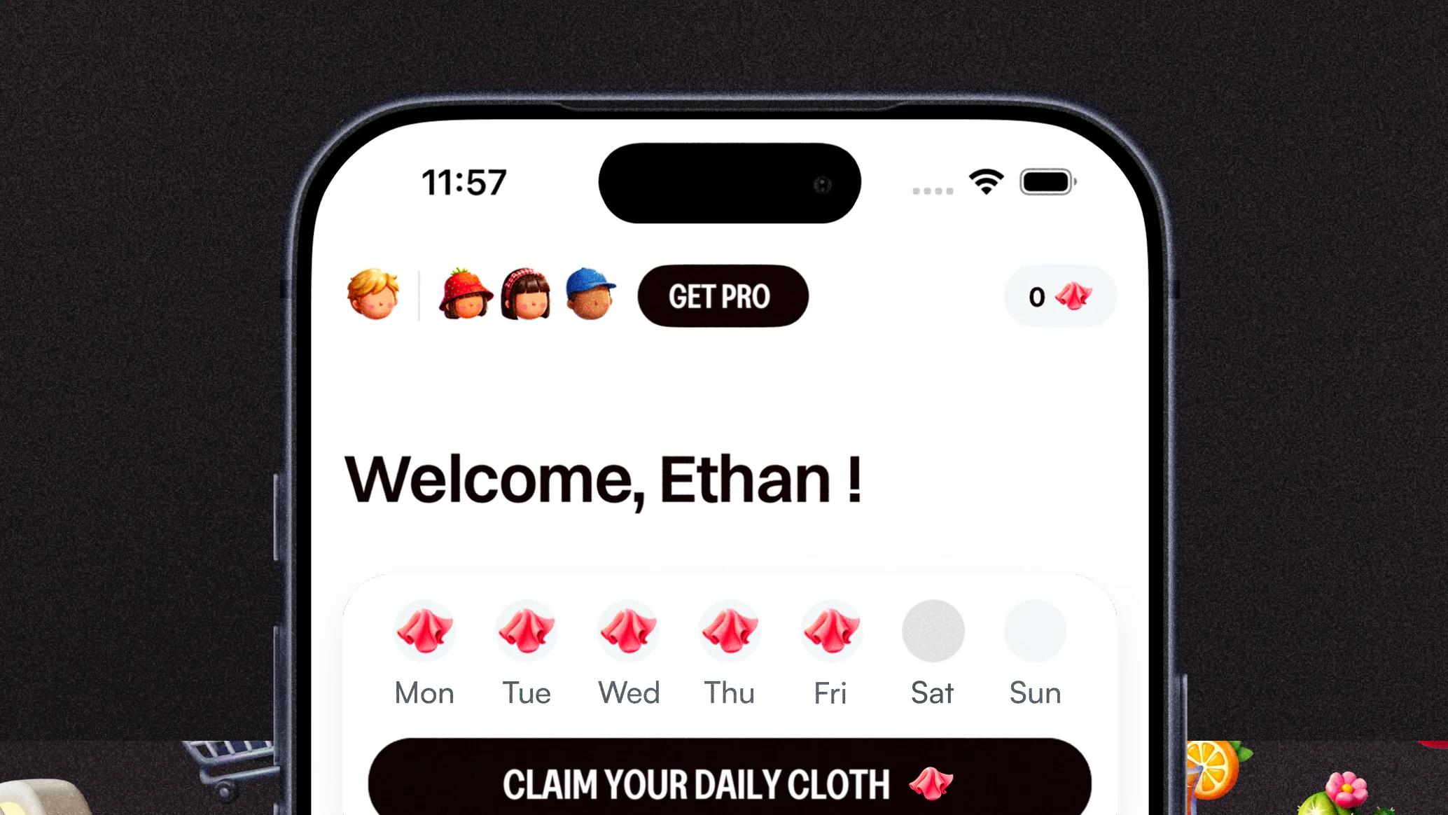
So Roomly doesn't leave chores open to the whole home: each person gets one task per day, and the tasks rotate automatically. A shared chore becomes one person's job, today, instead of everyone's job in general.
 MonTueWedThuFriSatSun
To make it last, the app relies on gamification, meaning mechanics borrowed from games. Every day you do your task, you earn a streak, which comes as a cloth, the app's small virtual currency. Each roommate's streaks add up into a shared pot, which then unlocks rewards the group picks for itself: a restaurant together, a night off dishes. Streaks aren't the point in themselves: they just give a concrete reason to do your task today rather than tomorrow.
It's not a blind bet: Duolingo, the reference for streaks, has published figures.
2.4×
more likely to come back the next day for learners with a 7-day streak than for learners without one.
Duolingo
14%
more 7-day retention in its Streak Wager test.
Duolingo
The group effect matters too: learners with at least one streak shared with a friend are 22% more likely to complete their daily lesson, the same logic as Roomly's shared pot.
Everything in the app serves one loop.
A feature that broke it had to go: I'd built an option to spend streaks to hand your task to a roommate. On paper it met a real need, but a habit only forms if everyone does their own task, day after day: if you can always pay to get out of it, it's a trade, not a habit. It never left my test build.
Design and development
On the build side, the workflow fits in one sentence: Figma to draw the screens, Xcode and SwiftUI to build them, and AI as a coding partner throughout the project to turn each mockup into a working screen.
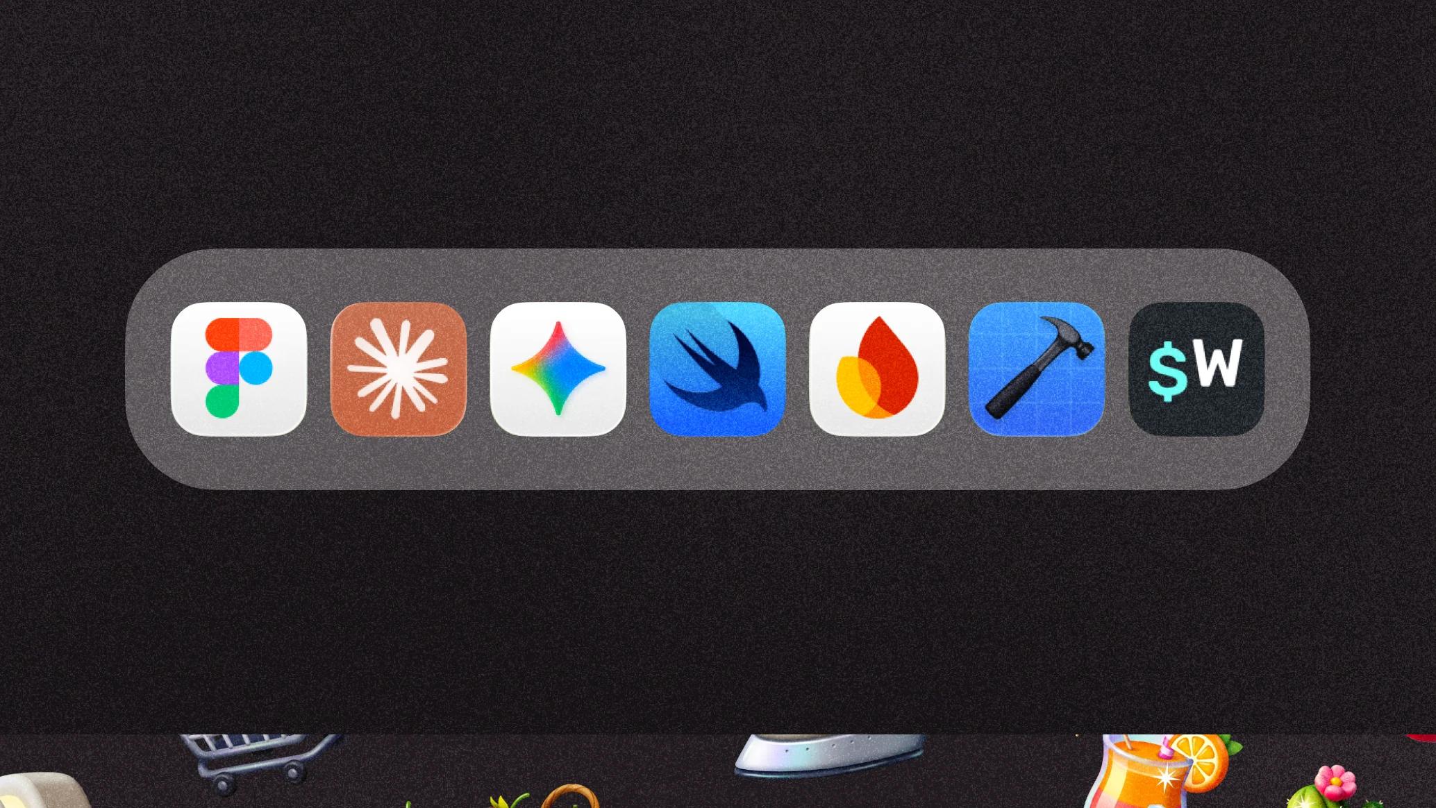
Firebase syncs tasks in real time between every member of the same home, and Superwall shows the subscription offer at key moments: right after onboarding, a week later, or the first time someone opens the rewards.
Free
Limits how many people can join a group.
Premium
Lifts that limit, so a whole family or a five-person group of roommates fits on one account. It also lets you manage several homes at once and create your own tasks beyond the default catalog.
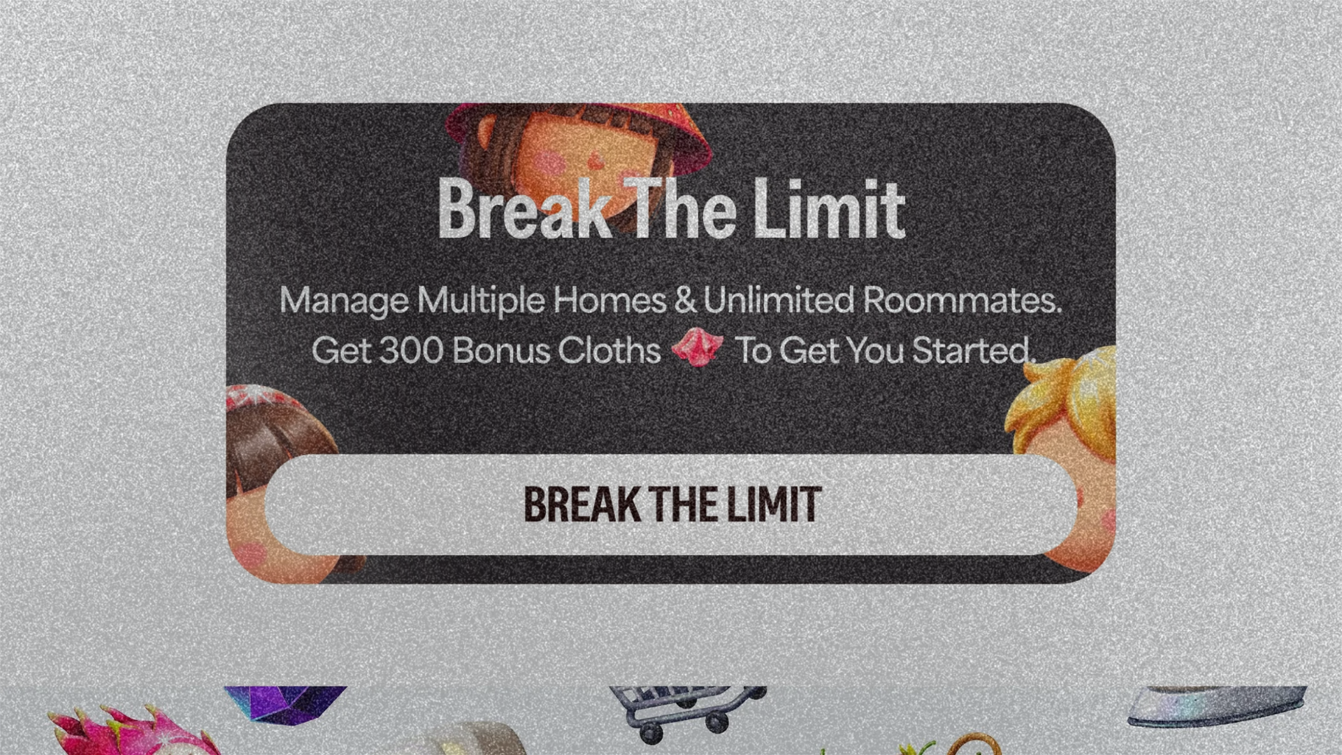
To make those moments stand out, a diagonal shine regularly sweeps across the elements meant to convert, like the paywall button or the reward cards: it catches the eye without being pushy and feels more polished.
Small details like this matter: how an offer is presented moves the numbers. Superwall's analysis of onboarding paywalls shows it.
9%
of the users who saw the paywall started a trial or bought when it was a single page.
Superwall, more than 40 million onboarding paywall views, February to May 2026
12.4%
when it was spread over several pages.
Superwall, same analysis
The app runs on three main screens.
- Home shows the task you need to do today and your roommates' tasks, and it's where you collect your daily streak.
- Cards shows upcoming tasks, lets you add new ones and has a leaderboard between roommates: longest streak, most tasks done, fastest.
- Account holds the settings, your groups and a shareable code to invite new people.
Your streak is on the line 🧺
9:41 AMDon't break it today. Claim your cloth.
Your task is still waiting
12:30 PMDishes won't do itself. What are you waiting for?
Free cloth, no catch.
4:05 PM👀 Just open the app and claim it.
Someone's already on a 5-day streak. 👀
6:15 PMYour cloth is waiting. Don't let them outrun you.
Push notifications keep the app alive even when it's closed, with four reminders:
- One to collect your streak.
- One when a new task is waiting.
- One when you're running out of time for today's task.
- One when a roommate has just finished theirs.
To make it concrete, picture four friends sharing an apartment, exactly the kind of place that inspired Roomly.
Setting up
One of them downloads the app and creates the group for the home at the end of onboarding, then shares an invite code: the others download Roomly and join with it.
Day to day
Everyone gets their tasks, dishes on Monday for one, trash on Tuesday for another, and finishing a task earns a streak. All the streaks together fill the group's pot, and a few weeks later it unlocks the reward the group set for itself, say a Friday night dinner.
When someone forgets
If someone forgets their task, nobody has to point it out: they just don't collect their streak that day.




Groceries
Pick-up fries, steaks...
Tasks are assigned by automatic rotation: nobody has to split them at the start of the week. The dishes simply move to the next person, the trash to the one after.
Visual identity
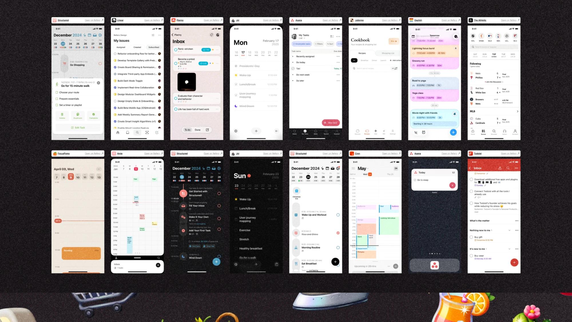
Before settling on a direction, I benchmarked a lot of organizer apps.
Most looked efficient, but not fun, as if that side had been taken out. I took that angle: an organizer app that is fun to open, carried through the shapes and animations of the UI, all meant to feel light rather than administrative.
Palette
Deliberately quiet: a near-black ink on a slightly bluish white, a soft blue-gray for what's selected and a warmer gray for secondary text.
Shapes
This calm base lets the fun come from elsewhere: cards, buttons and pills with very rounded corners and almost invisible shadows.
Two typefaces share the work: a condensed one for numbers and anything that needs weight, like the streak counter or a reward's price, and a rounder one for sentences. Serious about the numbers, warm about the rest.
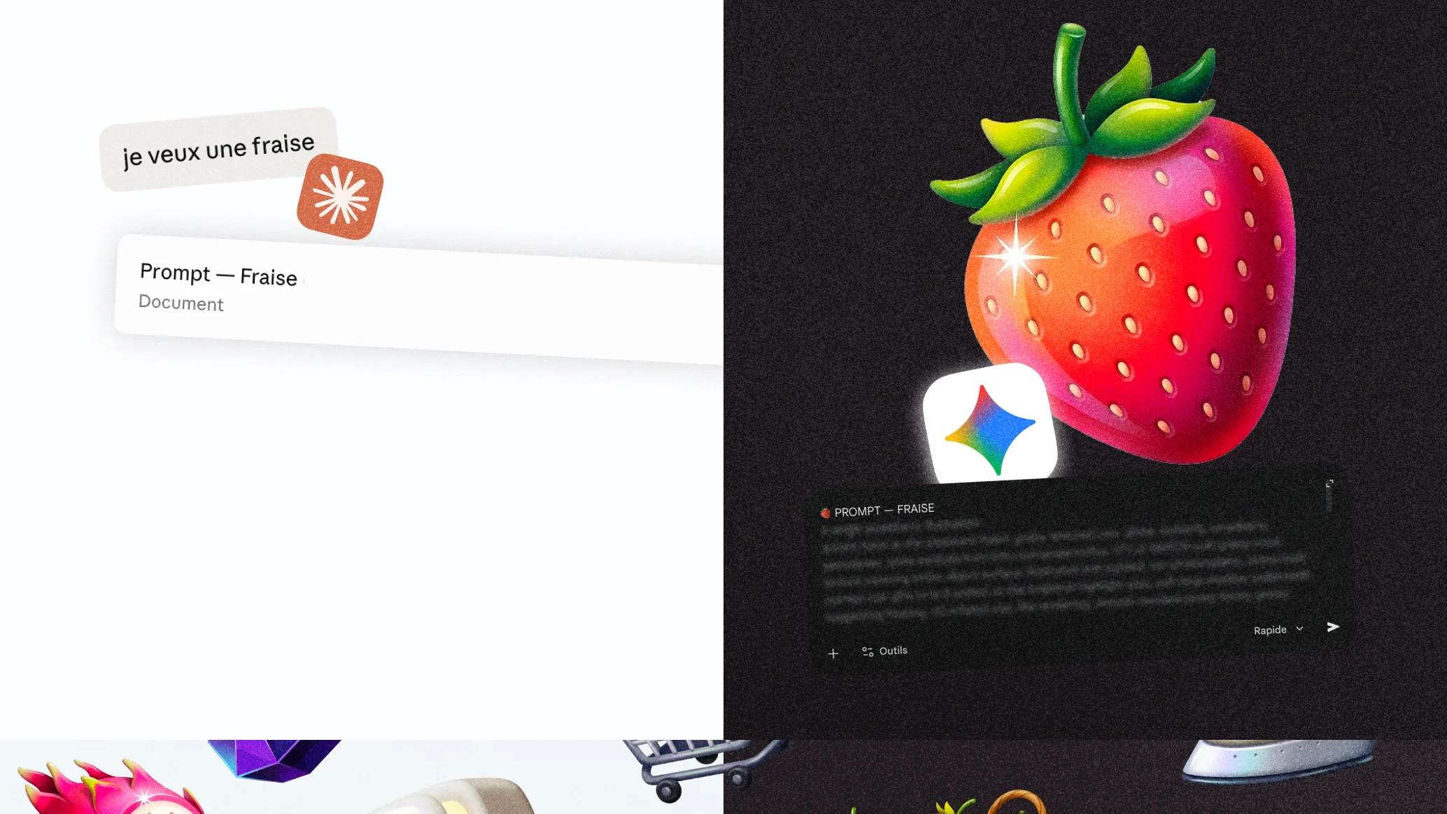
The illustrations went through two tools on purpose: a first AI turns a loose idea into a precise brief (style, palette, composition, format), and a second, which was better at the time at generating consistent images, creates the illustration from that brief. Splitting the brief from the image generation is what really made the difference.



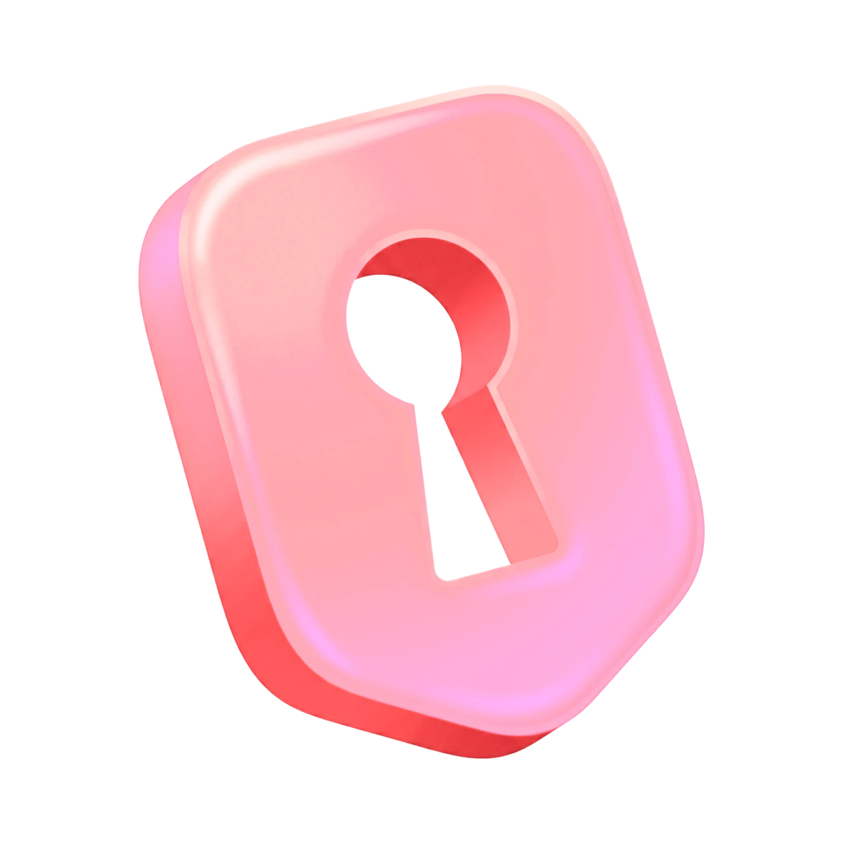
The app icon is built on a single shape: a keyhole, a symbol people get right away: the home, and the key you share with your roommates.
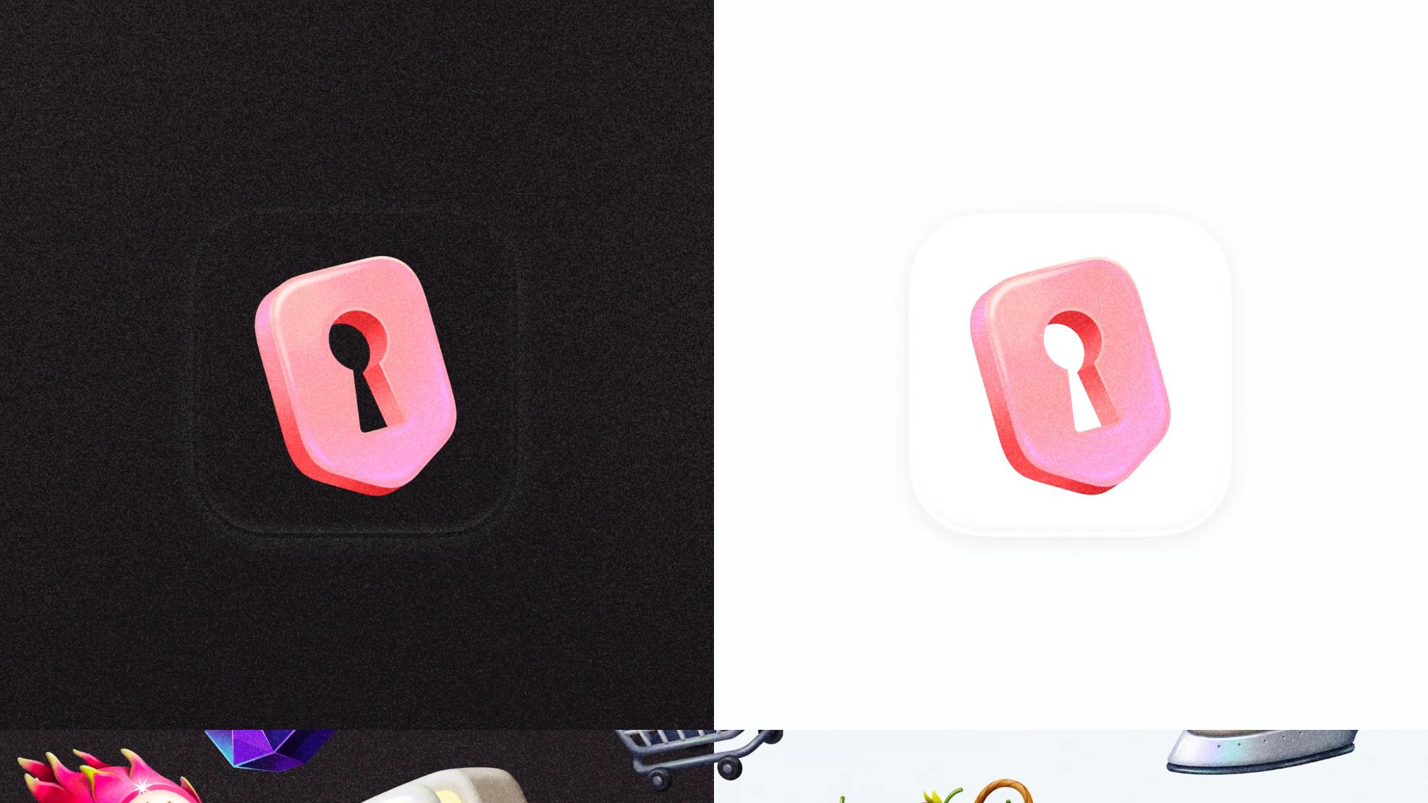
It's drawn in 3D, slightly puffed up and glossy, with a pink-to-coral gradient. It's the only bright color in the whole identity, on purpose: inside the app the palette stays calm, but on a home screen the icon has to stand out among dozens of others. It works just as well on black as on white, with a single version.
Conclusion
Six months in total, alongside a full-time job, but really just one intensive month where everything actually got built.
The rest was spent studying the problem and second-guessing the project itself. That month was enough to turn an empty SwiftUI project into an app that genuinely worked: real-time sync, a working subscription and an onboarding I was proud to show anyone. From the product to the code, down to every screen, nothing moved forward unless I did it myself.
Roomly didn't go further than that. I built it for a contest, and talking with the jury and with speakers who had already launched big apps showed me why, even though I already sensed it.
Learnings
The app worked best where the need was strongest: among roommates, who are also the audience least willing to pay for an organizer app.
I tried widening the target to couples and families, but a calmer household also needs this kind of tool less. Pleasing people and finding people willing to pay are two different problems, and I had only solved the first. RevenueCat's benchmarks say the same thing:
2.1%
of downloads convert to paying subscribers for the median freemium app.
RevenueCat
10.7%
for apps with a hard paywall.
RevenueCat
This project taught me to ask who will actually pay before designing anything, not after.
That said, I never saw Roomly only as a product to sell. It was also a way to learn, to challenge myself and to dive into a long stretch of deep, focused work over several months. Looking ahead to a possible release, I also spent time understanding how an app gets discovered without an ad budget, TikTok especially, and learning to read a market: competing apps' downloads, their positioning, how often they ship updates on the App Store.
Working with AI, for the code as well as the visuals, taught me a simpler lesson than I expected: the output only gets good once you brief it like a real collaborator. Asking for "a cute reward icon" gives a generic result you forget right away, while specifying the exact colors, the line weight and the emotion to convey changes it completely. The skill that matters is still art direction, applied to a collaborator who never gets tired of a fourth revision.
The project also became material for a talk I put together for my team at Synapse Medicine on what AI really changes in how design and engineering work together, with Roomly as the example from start to finish. One idea came out of it: recreating a flow or a micro-animation directly in code, instead of describing it in a deck, narrows the gap between what design imagines and what actually ships. Since then, with new tools like Figma Make, we try to work that way as a team.